The problem
The old flight planning engine was not working for anyone, so I redesigned that section first for the new engine, starting from what ops users told us.
MyGDC was a Honeywell Aerospace website that ops teams, dispatchers at customer sites and pilots used to plan flights, check weather, track flights and manage aircraft profiles. Flight planning was its largest section.
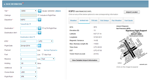
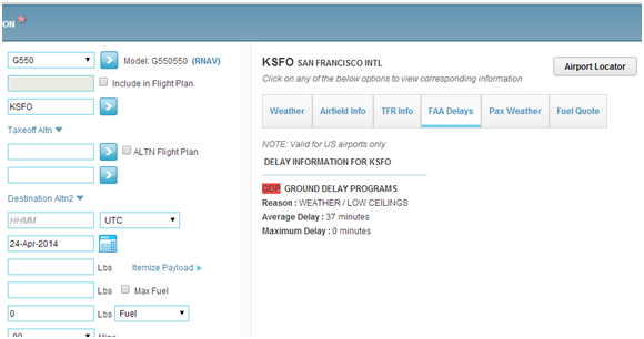
The interface had to change to work with a new planning engine. Ops users raised a map covered by a full-screen accordion, unhelpful error messages, difficult route editing, a cumbersome filing workflow and missing route comparison. The plan was to move the whole site to a new look one section at a time, starting with flight planning.
My role
I ran the workshop, mapped the experience and designed the pages that went live.
Someone had designed the existing site, but no one was working on it until this project started. I worked on the redesign alone until August 2017, when a designer joined. I handed the flight planning site to that designer in January 2018, when I moved to technical product owner work.
The work had two phases with different goals. V1 had to fit the existing site and the new engine; V2 aimed at a more modern look for an engine being built in house. It ran alongside two other projects: an AI-assisted maintenance app and a usability study of a pilot flight planning app.
Step 1: Map the current site
I mapped the whole site first so flight planning could be redesigned as part of a larger plan.
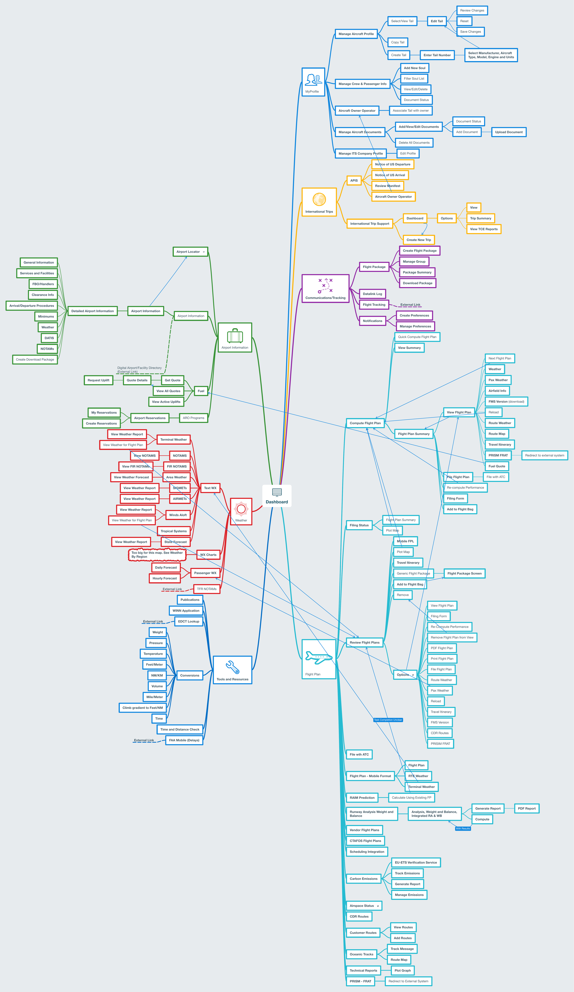
I walked through the live site and mapped all of it: profile, international trips, communications and tracking, airport information, weather, tools and flight plan.
I never got past flight planning, so the map stayed a record for later work.
Step 2: Run the ops feedback workshop
One workshop with ops and support showed me the full-screen accordion kept covering the map, one of the biggest problems to fix.
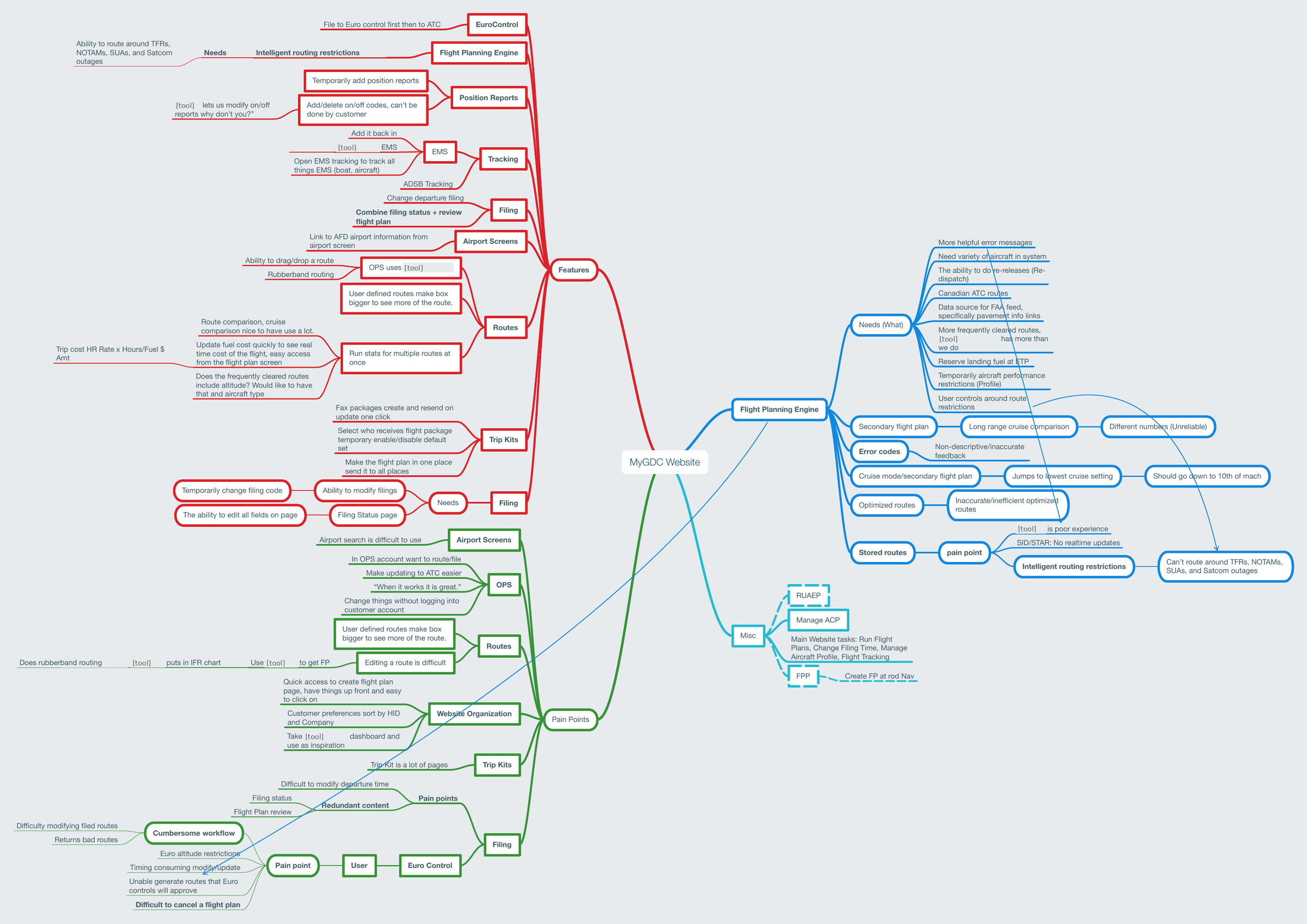
I ran one workshop with customer ops and support to hear what they needed from flight planning before designing it. I took notes, turned the discussion into a mind map of features, pain points and needs, then shared it back with them to validate it.
Themes included route comparison, easier route editing, filing status and edits in one place, trip kits and airport search. One of the biggest findings was that the interface opened each section as a full-screen accordion that kept covering the map. I addressed most of the mind map issues in the updated design.
Step 3: Map the flight plan workflow
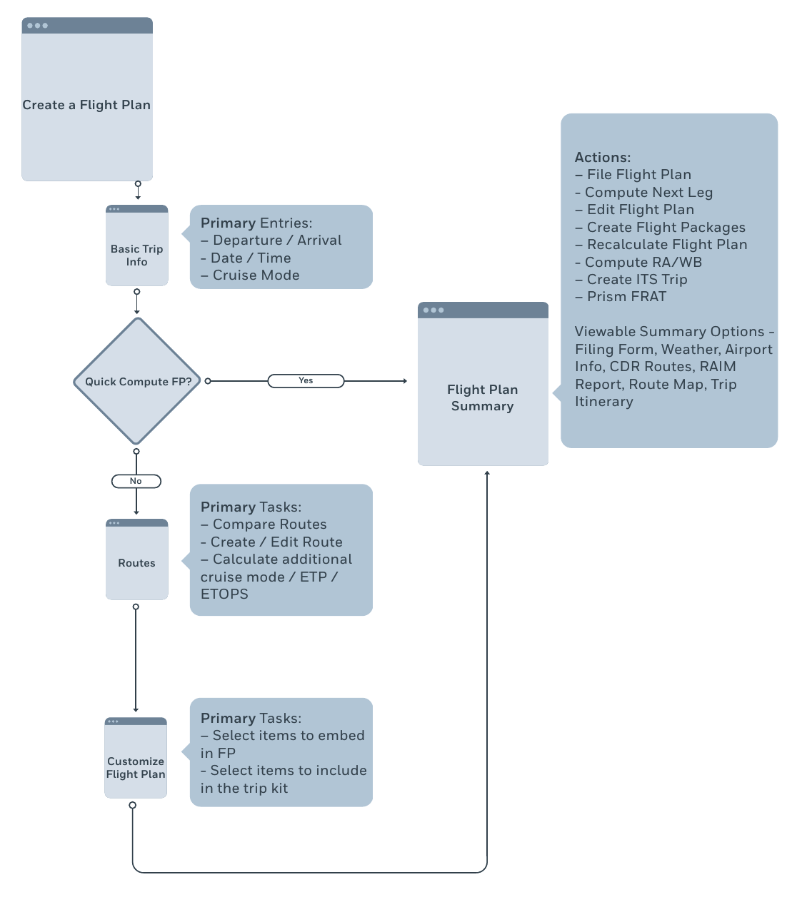
I set the order of the flight plan tasks before drawing any screens.
Before drawing screens, I drew the flow from basic trip information through an optional quick compute, route choice and customizing the plan to a flight plan summary. I worked from the live system and talked with the product owner about the new engine to understand what features it would support. The wireframes followed this workflow.
Step 4: Design and ship V1
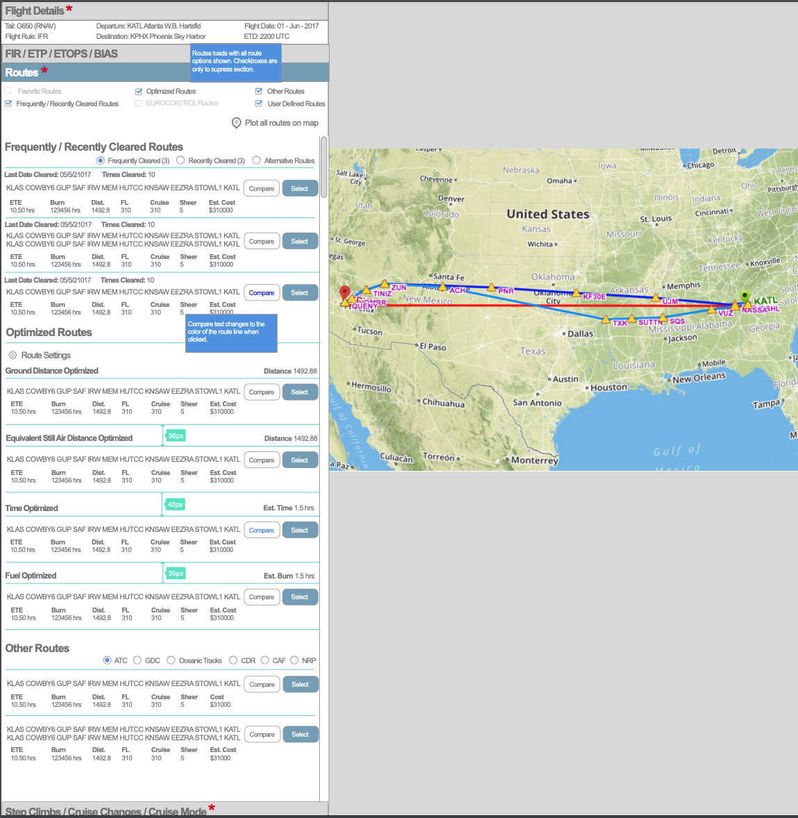
I designed and completed the V1 pages that went live in June 2017, keeping part of the existing teal look so they still felt like part of the site.
The pages covered flight details, airport search with weather, route comparison and step climbs with cruise modes. I completed V1 and prototyped it.
We were making big changes to the flow and were not replacing the whole site, so keeping some of the existing teal styling helped V1 still feel like part of the site.
V1 was not tested or reviewed before launch. It was an interim step, so the team did not want to spend much time on it. It went live in June 2017, with the map and the form side by side instead of the accordion covering the map. The better routes users got came from the new planning engine; the redesign made the interface work with that engine and fixed the covered map. V1 was not evaluated after launch either, so I have no usage or adoption result to report.
Step 5: Start V2 and hand off
I started the modern design for the new engine and handed it to a designer who built on it.
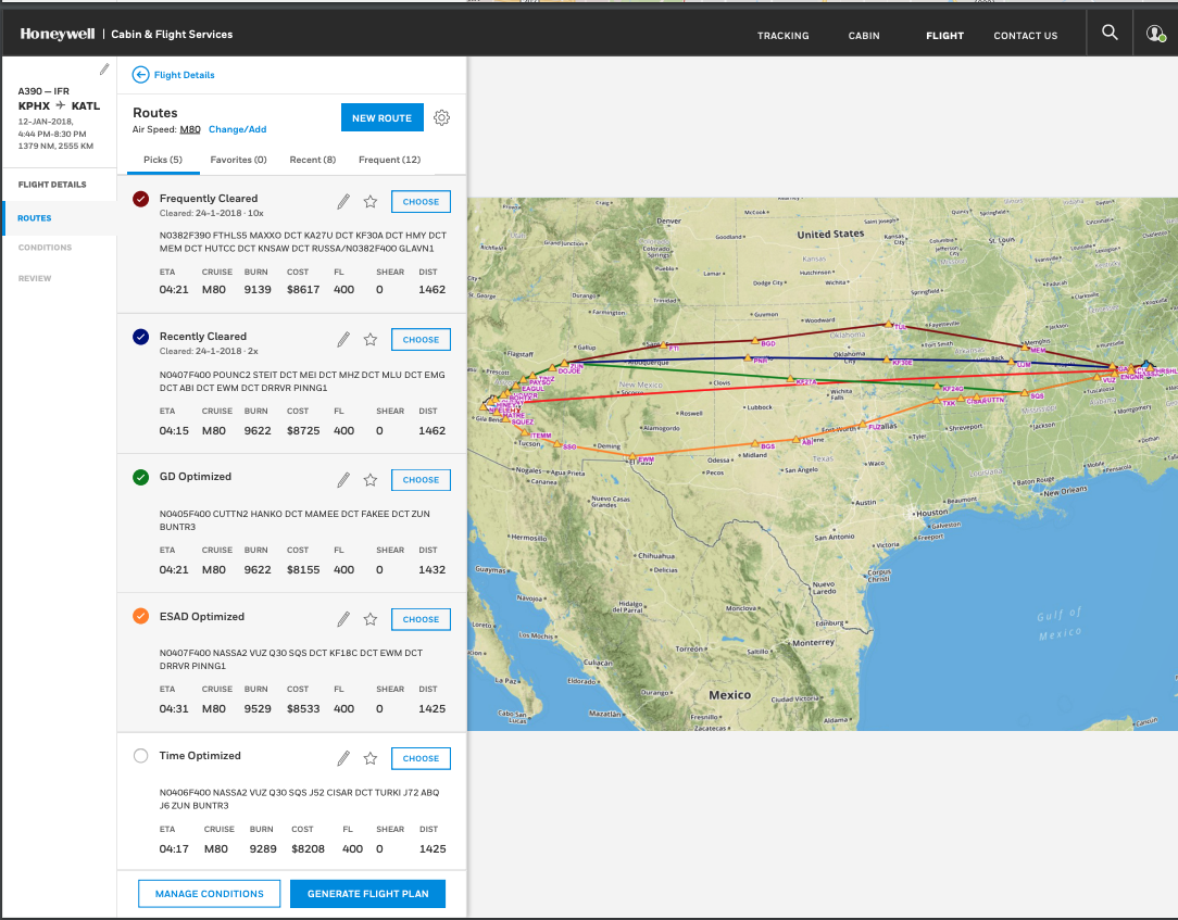
I started V2, a more modern look aimed at the flight planning engine being built in house. I worked in the same office as the team building that engine, so I knew what features they were putting in, and I worked closely with the product owner and engineers.
V2 was not finished under me. I handed the flight planning site to the designer who joined in August 2017, and he added features across the whole flow after I moved to technical product owner work.
What I learned
Understand the whole system, its users and the people building it before changing one part.
-
Map the whole before redesigning a part
Mapping the full site showed me how it was structured and how flight planning fit with everything else.
-
Let users show how far to go
The ops workshop showed me how the design could evolve without causing major disruption to users.
-
Understand what you are designing before you design it
I learned the new system before drawing the screens. Sometimes that understanding comes from talking to customers, sometimes from understanding the technology and sometimes both.
-
Work next to the people building the engine
Being in the same office as the engine team let me bring in what I had learned from pilots in the Flight Bag Pro study and from the support team.